A couple of weeks ago I made a simple (yet complicated) visualization in Tableau about mental illness in the US. If you want to know how this viz was put together step by step, scroll down and see me break it down. You can explore the interactive version on Tableau Public.
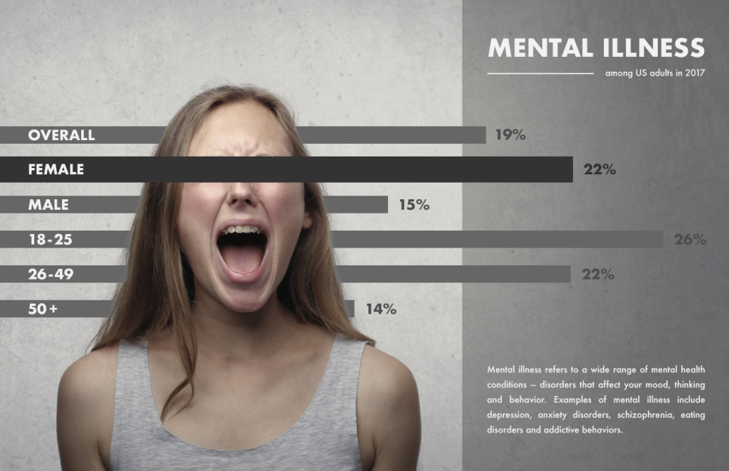
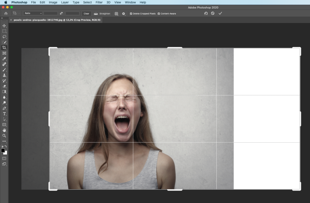
I learned the hard way that you should use images carefully when it comes to sensitive topics, but as the girl in the picture is not recognizable I think it’s safe to use this photo to emphasize an important issue. The pic was taken by Andrea Piacquadio and downloaded from Pexels. The first edit I did is to add a little more space to the right of the figure. It’s an easy step to do in Photoshop, you just have to “crop it bigger” while ticking in the Content-Aware box.


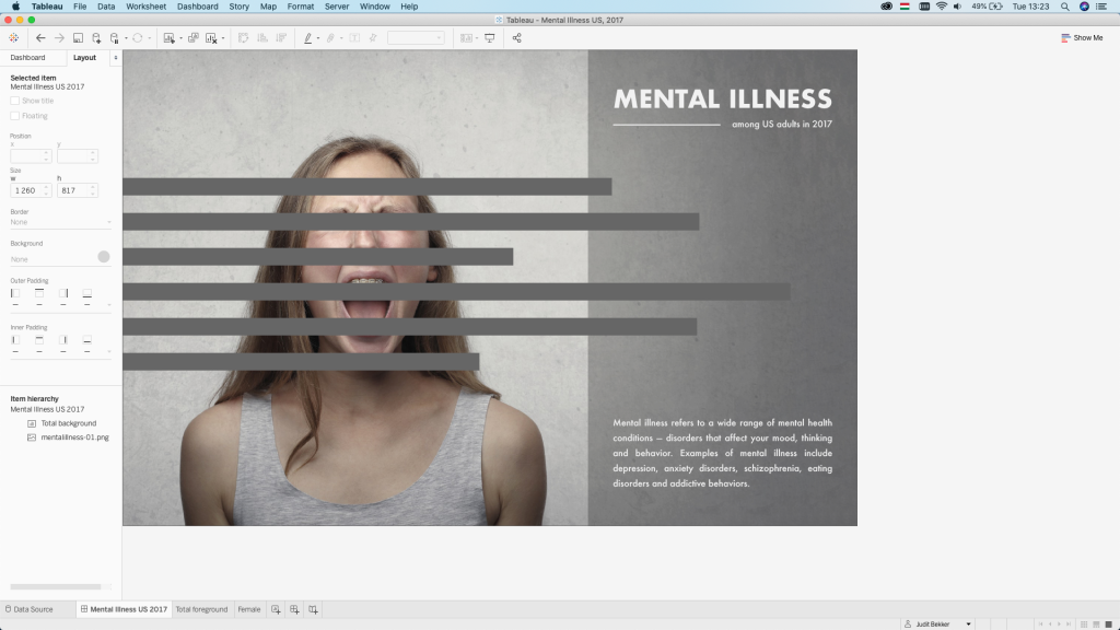
The next step was adding the title and the text in Illustrator, that I could use as a background image in Tableau. I drew a darker grey rectangle under the text to make it more readable and separate from the photo. This also helped me to hide the parts of the image that looked weird due to the cropping instead of further editing it in Photoshop with the Stamp or Clone tool.

After that, it was time to add the first the bar chart to the canvas:
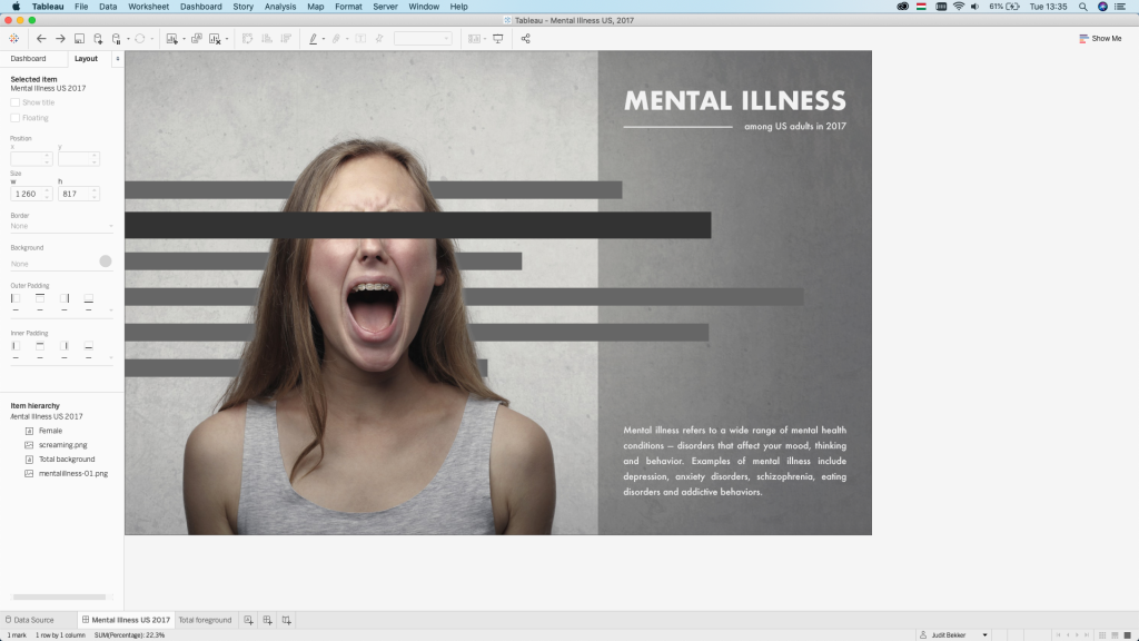
This is where the tricky part came because I had to duplicate the photo and remove all the background and make a png that only shows the girl. To do this I used a tutorial by Daniel Walter Scott’s Photoshop course on Udemy, which explained how to use the Select and Mask tool in this case. If you want to do the same, here’s a free Youtube video that explains the process:
After spending some time making the hair selection as good as possible (but still not great), this is what I ended up with. I added the png version of the girl on top of the bar chart in Tableau.


As I wanted to have that censored effect to cover her eyes, I added another bar chart using only the second bar, that I made the same width, but increased the height to achieve this effect.
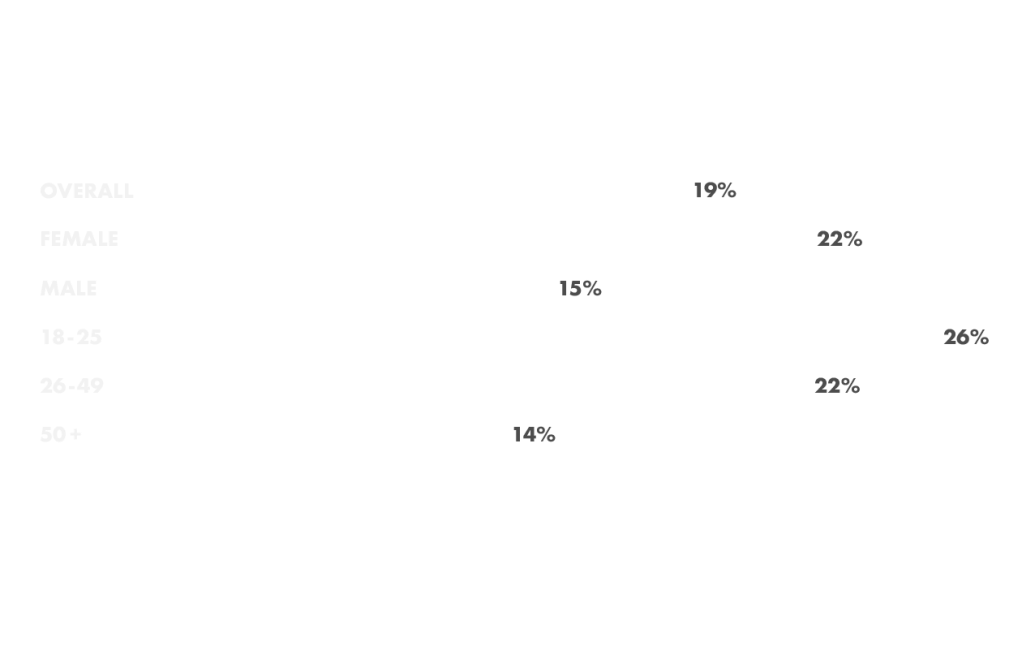
The next step was adding the labels, which was another Illustrator board. I exported the dashboard image at this point to be able to place the labels in Illustrator and I used the show/hide function before exporting it. This option is only available if you use layers, which is recommended even for simple vizzes like this.

The last thing to do was replicating the original bar chart with 0% opacity that I placed on top. It had the same coordinates (x, y, w, h) as the chart below to be able to show the tooltips.

Hope you enjoyed this tutorial, I got hooked up with the Illustrator – Photoshop – Tableau trinity, so brace yourselves for similar contents coming soon!

5 Comments